A few weeks ago I attended the John Keatley Survival Guide business workshop held at Rob Grimm's studio in St. Louis. One of the many things we talked about was creating a since of style in our photography.
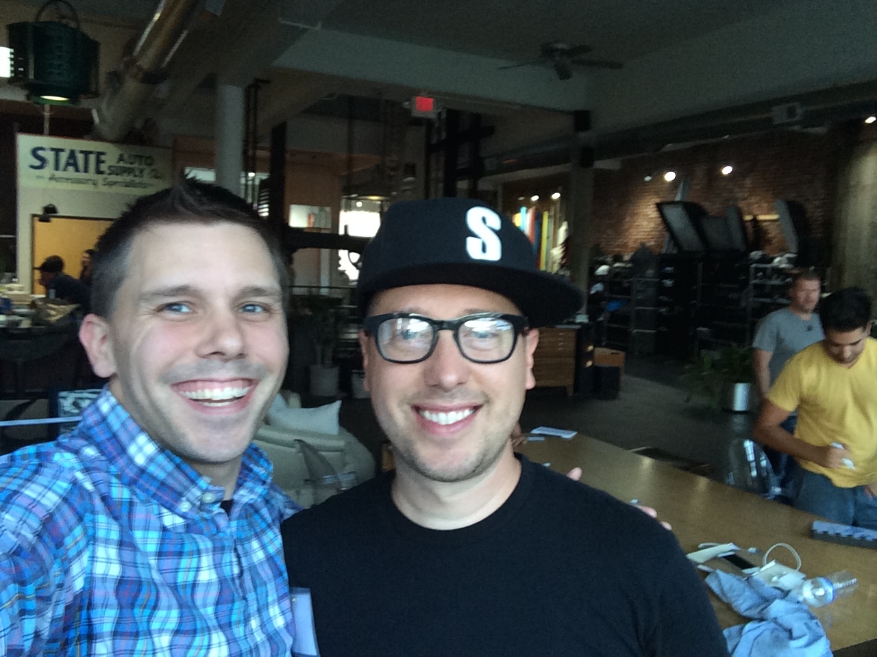
John Keatley and I in St Louis during the Survival Guide workshop at Rob Grimm's studio.
I tried to take that to heart and thought a lot about what I enjoyed taking photographs of as well as how I can integrate Photoshop compositing into my product photographs. Once I narrowed the ideas down on my four hour dive home my brain has exploded with ideas.
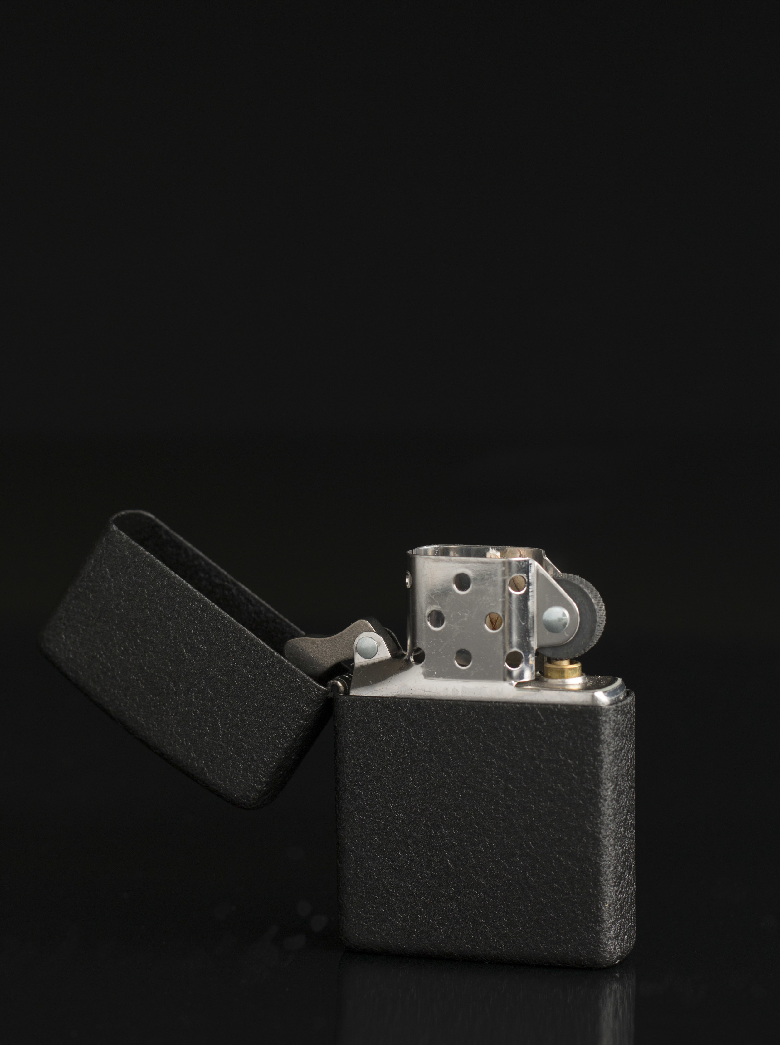
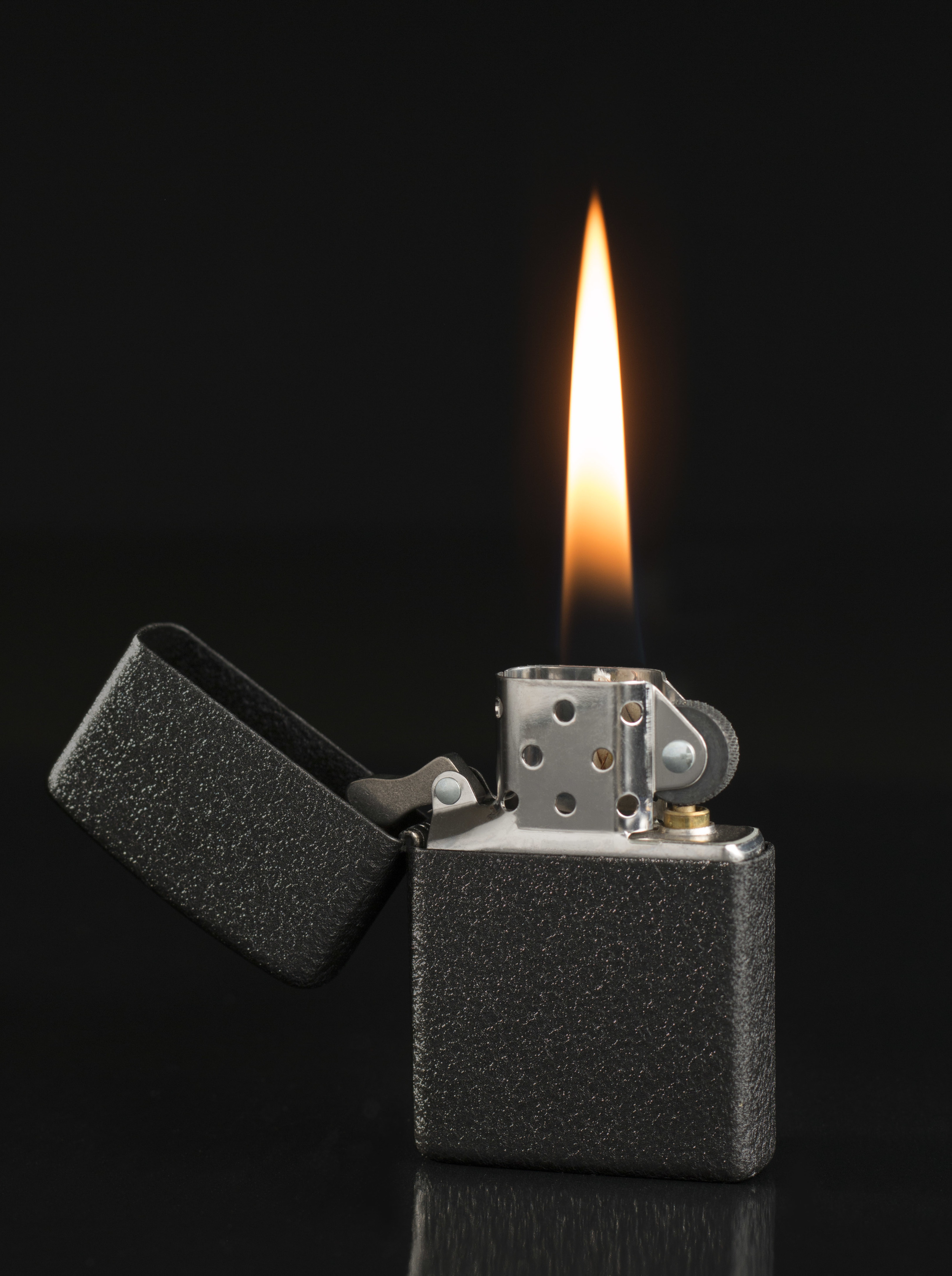
My normal process of product photography, although complex, has been fairly simple by comparison.
My goal is to do a several photographs with the product composited in a scene. I have a good but evolving idea of the theme I would like for the scenes but I will talk about that further as I progress.
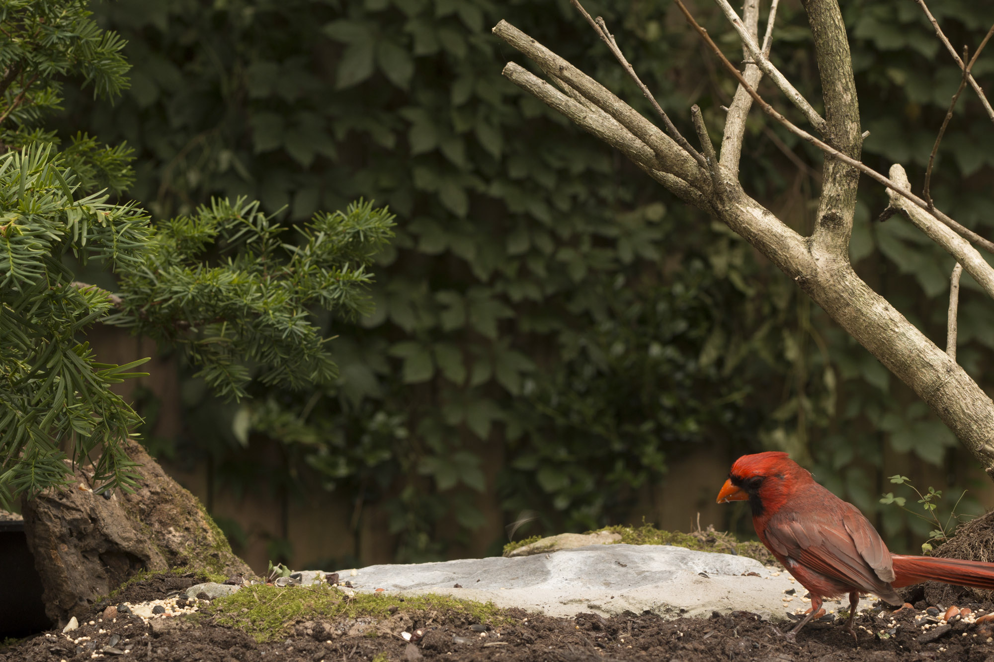
For this photo the idea was to combine an out door scene with birds looking at and admiring red New Balance Minimus shoes. I wanted it to feel as if the birds were reconsidering this whole walking thing. I wanted red shoes to contrast the green of the planed background. Also, I had seen a pair of cardinals living near my house would work perfect to compliment the shoes. Assuming I could entice the birds to have their picture taken.
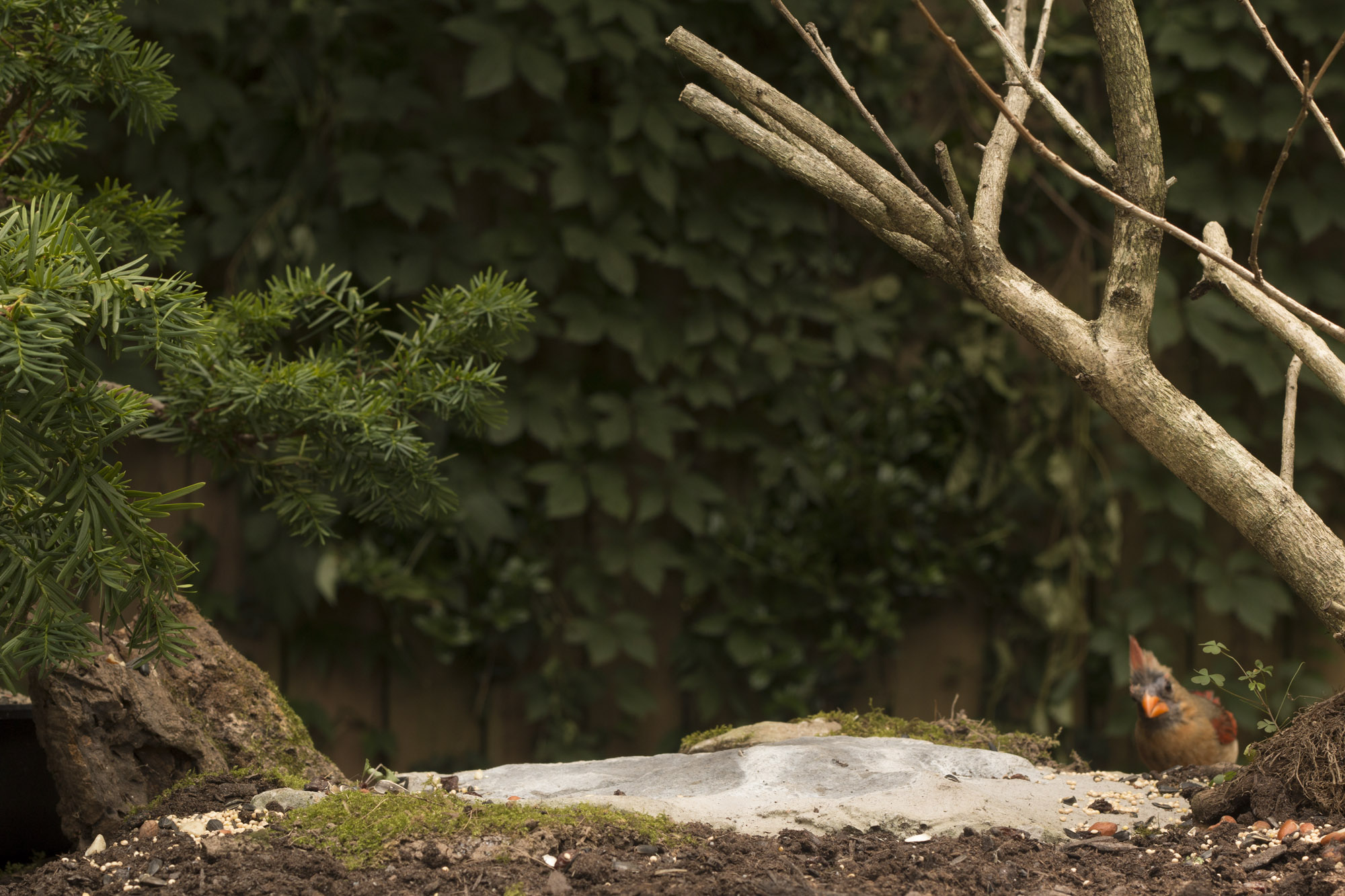
I ordered the shoes and started building a set that I could leave outside. I got a flat stone to put the shoes on, surrounded it with dirt and moss, put a dead leafless bush on one side and a potted plant (a yew) on the other side. I moved the whole setup to the fence in the back of my Nashville home. I then added some foliage to the fence to fill in gaps in the already existing greenery and some seeds to the table to attracted the birds.
Then I waited... four days till birds finally realized there was a ton of food on the table and my tripod was not there to eat them.

After I saw enough birds partaking in seeds, I set up my camera with a remote. Slowly over the next four hours birds flew in and out of the scene eating seeds. I finished up the day by removing all the seeds I could and placing my shoes on the set to get a shadow on the rock so it would be easier to composite the shoes into the scene.
The next day I went about taking photos of the shoes inside my studio. I took the stone from my set outside. (It had to be dried with a hairdrier because it had rained all night.) I used the overlay option in Capture One to get the stone is a position as close as possible as what it was on set. I then did the same for the shoes.
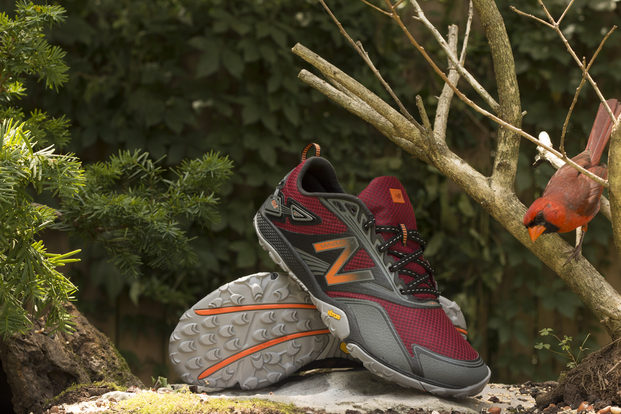
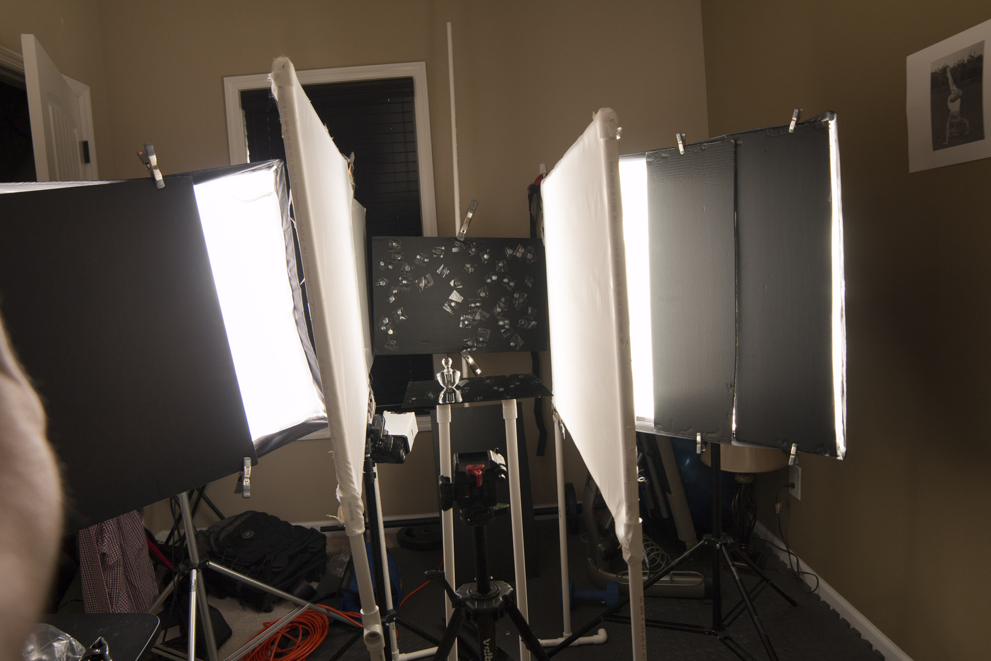
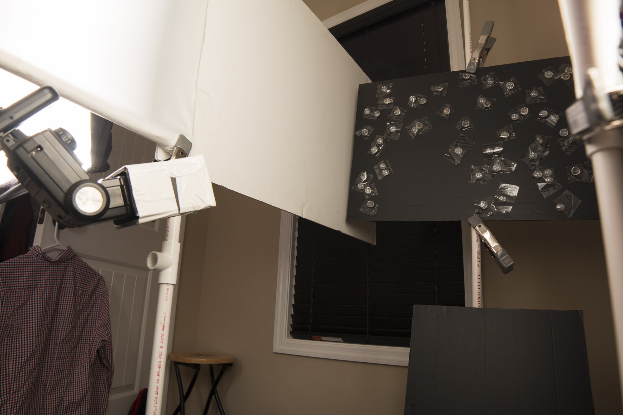
My goal with lighting the shoes separately was to control the light to make the shoes pop more and seem very dynamic, but I needed to keep it fairly consistent with the light from outside for continuity. I set up three lights: a large softbox from above, a 20 degree gridded light on the right and a 10 degree gridded light on the left slightly behind the hill.

Then I started combining it all in Photoshop. I had to move some of the birds but that was made easier by the consistency of the light on the set. After I added the shoes I thought I was about done but I was bothered by the lack of foliage on the right side. I went back outside set up my camera on a remote and used the potted yew to build foliage around the limbs of the dead bush on the right.
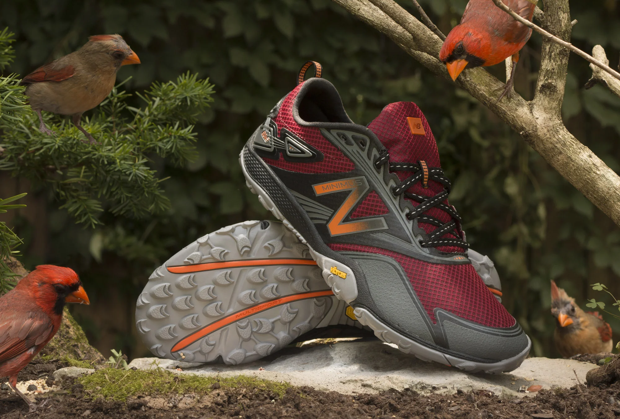
Happy with the results I composited those photographs in and finished the image by cleaning and toning.
I'm really excited about the results. Not simply because it came out well but also by how close it was to what I had pre-visualized. I think its a great start to a new direction for my photography.